Title Research: Random Acts of Violence
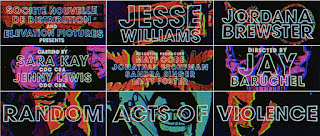
While we viewed the title sequence for “Random Acts of Violence” we found it had in total around twenty-five titles. It had titles for the name of the film, the producer, the writer, the music, the studio company, the costume designer, the illustrator, the director, etc. The titles were white block letter style and had a heavy graphic overlay, a dark black background with bright primary colors flashing. Throughout the opening sequence, there were images of skulls and people laying on the ground that had an essence of death and violence. There were also images of creepy extreme close-up smiles. It made us feel negatively overstimulated giving us a sense of foreboding. We could feel something dreadfully unexpected will take place throughout the film. Also, there was a section of extreme close-ups on different people's faces specifically focusing on their eyes. This section had quick-paced editing. The film's editing, color palette, audio, and lighting reinforce the thriller genre of random acts of violence. The title sequence included dark lighting with flashes of colors with digital effects added to the titles that give them a saturated hue. It created a distressed ambiance. They are you doing this title sequence was suspenseful music that was part of the soundtrack. This technical code created a sudden grasp of attention to the fast-paced editing and graphic images. The audio was distorted and was intensely forte. This type of audio reinforced the suspense for shocking feelings that a thriller film conveys. Also, the transitions between images were seamlessly correlated with the music. When there was a high music note that changed to low, the background image would cut and there would be a new shot. The technology used to produce this title sequence was very effective in capturing the thriller genre conventions. The target audience for this film is people who enjoy thriller novels that evolve to be a film. This film and the novel that accompanies it is about comic writers and the target audience will appeal to the comic-like editing in the sequence. It also included bright saturated colors that appealed to and grab the attention of the audience. Additionally, due to the editing being glitchy in a sense it gave to the target audience that media is taking over which is appealing to the target audience.


Comments
Post a Comment