Title Design Blog
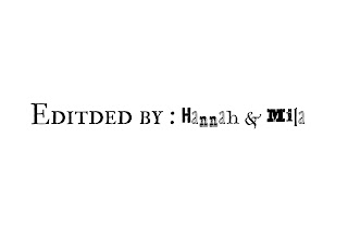
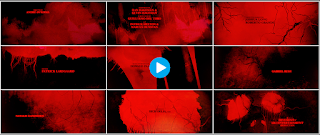
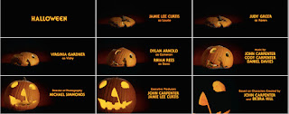
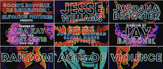
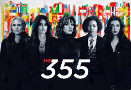
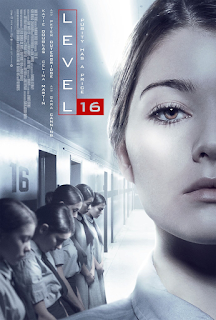
Some of the fonts we were planning on using in our film include Alta California, IM FELL Double Pica SC, and Juniper Std. For Alta California, we would use it when we show our names. For example, when we write “Edited by: Hannah and Mila” it would be used on “Hannah and Mila.” It is a sticker-like decorative font that has a rugged look to it. It relates to the film we are creating because it is a story about a girl who has a rugged life and mentality. Also, the font has a youthful feeling attached to it which correlates to how the film is made about teenagers. It also has a scary and mysterious feeling to it, which matches the overall tone of the film. It relates to our thriller genre and emphasizes the mood that we are trying to implement. For IM FELL Double Pica SC, we would use it for the title descriptions. For example, when we write “Edited by: Hannah and Mila” it would be used on “Edited by.” It is a serif small caps font with a rugged, traditional, and sophisticated a...
